
Visual Weight Explained: How to Create Balance With Tile (Intentional Design)
- 11 hours ago
- 10 min read
When planning a tile renovation, most people focus on color, pattern, or material—but there’s another design principle quietly shaping how a space feels: visual weight. Visual weight refers to how “heavy” or “light” an element appears in a space. It’s not about actual weight, but rather how much attention something draws and how grounded or airy it feels within the overall design. Understanding this concept can make the difference between a space that feels balanced and intentional - and one that feels slightly “off,” even if you can’t immediately explain why.


What Gives Tile Visual Weight?
Several factors influence how heavy or light a tile feels visually
COLOR
Color plays a major role. Darker tiles tend to feel heavier and more grounding, while lighter tones feel more open and expansive - but there’s a bit more nuance to how this actually shows up in a space. When choosing tile, it’s less about picking a color you like in isolation and more about understanding how that color will behave in the space. The right choice doesn’t just look good on a sample - it helps shape how the entire room feels once it’s installed.
Darker tones - like deep charcoals, warm browns, or rich navy - visually “anchor” a room. Designers often use them to create a sense of stability, especially on floors or lower portions of a space. This is why you’ll often see darker tile used on bathroom floors or shower pans - it grounds the design and gives the room a more settled, finished feel. In larger spaces, darker tile can also help make the room feel more intimate and defined rather than overly open or undefined.
On the other hand, lighter tiles - soft whites, creams, light grays, or sandy tones - reflect more light, which naturally makes a space feel brighter and more expansive. This is especially helpful in smaller bathrooms, kitchens with limited natural light, or areas where you want a clean, airy feel. Large-format light tiles, in particular, can visually “stretch” a space by reducing contrast and minimizing visual interruptions.
Undertones also matter more than most people expect. A cool gray tile and a warm beige tile may be similar in lightness, but they create completely different atmospheres. Cool tones tend to feel more modern and crisp, while warmer tones feel softer and more inviting. Mixing undertones without intention is one of the most common reasons a space can feel slightly off, even when all the individual elements are beautiful.
Contrast is another key consideration. A high-contrast combination - like dark tile paired with light grout - adds more visual weight and draws attention to the layout and pattern. A low-contrast look - where tile and grout are closer in tone - feels more subtle and seamless. Neither is right or wrong; it simply depends on whether you want the tile to stand out or quietly support the overall design.
A helpful way to think about it is in layers. Many well-balanced spaces combine both light and dark elements: a darker floor to ground the room, lighter walls to open it up, and perhaps a mid-tone or textured feature to add depth. When color is used this way, the space feels intentional - not flat, but not overwhelming either.
SCALE AND SIZE
Larger tiles with minimal grout lines tend to create a calmer, more seamless look, while smaller tiles or intricate patterns naturally feel busier and carry more visual weight - but how this plays out depends on how you use them in the space.
Large-format tile is often used when the goal is to simplify the visual field. Fewer grout lines mean fewer interruptions, which allows the eye to move more smoothly across the surface. This is why you’ll often see larger tiles used on floors or shower walls when a clean, modern, or spa-like feel is the goal. In smaller spaces, this can actually make the room feel bigger - not because the tile is large, but because the overall look is less visually fragmented.
Smaller tiles, on the other hand, introduce more detail and repetition. Each grout line adds a bit of contrast, which builds visual texture across the surface. This isn’t a negative - it’s what gives materials like mosaics, penny tile, or zellige their charm. But it does mean they naturally draw more attention and feel more “active” in a space. This is where intention becomes important. If you use a smaller-scale tile across an entire room - floor to ceiling - it can start to feel overwhelming, especially if there’s also variation in color or finish. But when used more selectively, like in a shower niche, backsplash, or feature wall, that same tile becomes a focal point rather than competing with everything else.
Proportion also plays a role. A very large tile in a tight or highly detailed space can sometimes feel out of scale, especially if it results in awkward cuts or disrupts key lines in the room. On the flip side, very small tile in a large, open area can feel visually busy unless it’s balanced with simpler surrounding elements. Designers often think in terms of contrast here as well - pairing a larger, more minimal tile with a smaller, more detailed one to create hierarchy. For example, a large-format floor paired with a smaller backsplash, or a simple wall tile with a more intricate shower floor. This layering helps guide the eye and gives the space dimension without overwhelming it.
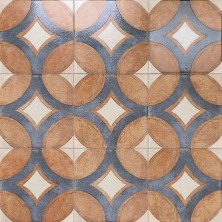
PATTERN AND CONTRAST
Pattern and contrast naturally draw the eye. A bold, high-contrast tile will feel more dominant in a space than a subtle, tonal design - but what really matters is how that visual attention is being directed and balanced within the room.
Pattern is one of the most immediate ways tile communicates personality. Geometric layouts, encaustic-inspired designs, or strong directional patterns like herringbone or chevron create movement. The eye follows them, which means they automatically become a focal point - even in a simple space. This is why patterned tile is often used intentionally in smaller doses, such as a backsplash, entryway, or niche, where it can stand out without overwhelming the entire environment.
Contrast works in a similar way, but more through difference than repetition. High-contrast combinations - like black and white tile, or dark grout against light tile - emphasize shape, layout, and grid. They make every line visible, which adds structure and definition to the design. This can feel very crisp and architectural, but it also means the surface becomes more visually active.
On the other end of the spectrum, tonal or low-contrast tile choices create a much quieter effect. When tile and grout are closely matched, the pattern softens and the surface reads more as a whole rather than individual pieces. This approach is often used when the goal is a calm, continuous backdrop rather than a statement moment.
Neither direction is inherently better - it depends on what role you want the tile to play in the space. A high-contrast or patterned tile is ideal when you want a clear focal point or a sense of personality. A tonal approach works better when the tile is meant to support other design elements, like cabinetry, lighting, or architectural features.
One of the most effective design strategies is balancing the two. For example, a patterned or high-contrast backsplash paired with more neutral flooring, or a subtle wall tile combined with a more expressive floor. This layering creates hierarchy, which helps the space feel intentional rather than visually competing with itself. When thinking about pattern and contrast, the key question is not just “Do I like this?” but “How much attention do I want this surface to carry?” That answer will almost always guide you toward a more cohesive and lasting result.
TEXTURE AND FINISH
Texture and finish add another layer to the project. Matte or textured surfaces tend to feel more grounded, natural, and tactile, while glossy finishes reflect light and can feel brighter and more elevated - though the effect really depends on where and how they’re used in the space.
Matte finishes absorb light rather than bounce it back, which gives them a softer, more understated presence. This is why they’re often chosen for floors, especially in areas where you want a sense of calm or subtlety. They also tend to hide smudges, water spots, and everyday wear a bit better, which makes them especially practical in high-use spaces like bathrooms, kitchens, and entryways.
Textured tile takes that idea even further. Whether it’s a subtle handmade variation, a stone-like surface, or a more pronounced relief pattern, texture introduces depth you can both see and feel. It adds an organic quality to a space and often makes the design feel more layered and grounded. This is especially effective when you want a space to feel warm, lived-in, or connected to natural materials.
Glossy finishes behave very differently. Because they reflect light, they tend to make spaces feel brighter and more open. In smaller rooms or areas with limited natural light, this can be a strong advantage. Glossy tile also has a more polished, refined feel, which is why it’s often used on walls, backsplashes, or accent areas where durability under heavy wear isn’t the primary concern.
However, reflectivity also means more visual activity. Light, shadows, and even movement in the room can become part of the surface itself. In some cases, that adds energy and interest; in others, it can feel visually busy if overused.
Many intentional & well-designed spaces use a combination of finishes - for example, a matte floor paired with a soft sheen wall tile, or a glossy backsplash set against more muted surrounding materials. This contrast adds dimension without relying on color or pattern alone. Another subtle but important detail is how finish interacts with lighting. Natural light tends to enhance texture and variation, while artificial lighting can amplify gloss and reflection. This means a tile that looks soft and understated in a showroom might feel very different once installed in your home.
When choosing between finishes, it helps to think less in terms of “which is better” and more in terms of atmosphere. Do you want the surface to recede quietly into the background, or do you want it to catch light and become part of the visual focus? The answer will guide not only the finish you choose, but how the entire space feels once it’s complete.


Why Visual Weight Matters in Tile Design
Creating a sense of flow and balance
Tile isn’t just a surface - it shapes how a space is experienced the moment you walk in. It sets the tone, guides the eye, and quietly determines whether a room feels balanced, calm, busy, or unfinished. Even when people can’t name it, they feel it immediately.
This is where visual weight becomes important. Every tile choice carries a certain “presence” in the room. Some surfaces naturally pull attention toward them, while others recede into the background. When these elements are not considered together, a space can start to feel slightly off - even if each individual tile is beautiful on its own.
If too many visually heavy elements are concentrated in one area, the room can feel crowded or top-heavy. For example, a bold patterned floor combined with a high-contrast backsplash and a dark shower wall can compete for attention rather than work together. Nothing is necessarily wrong, but the eye doesn’t know where to land. The result is a space that feels visually loud or unbalanced, especially in smaller rooms where every surface is close together.
On the other hand, if everything is too light, too uniform, or too minimal, the space can lose depth. A room with all-white tile, matching grout, and no variation in texture or tone can feel flat or unfinished. It may be clean, but it might lack contrast and definition - there’s nothing grounding it or creating subtle hierarchy. Good tile design is about distribution. Instead of treating each surface independently, you’re thinking about how they work together as a whole composition. Visual weight is what helps create that structure.
A well-designed tile layout distributes this weight intentionally:
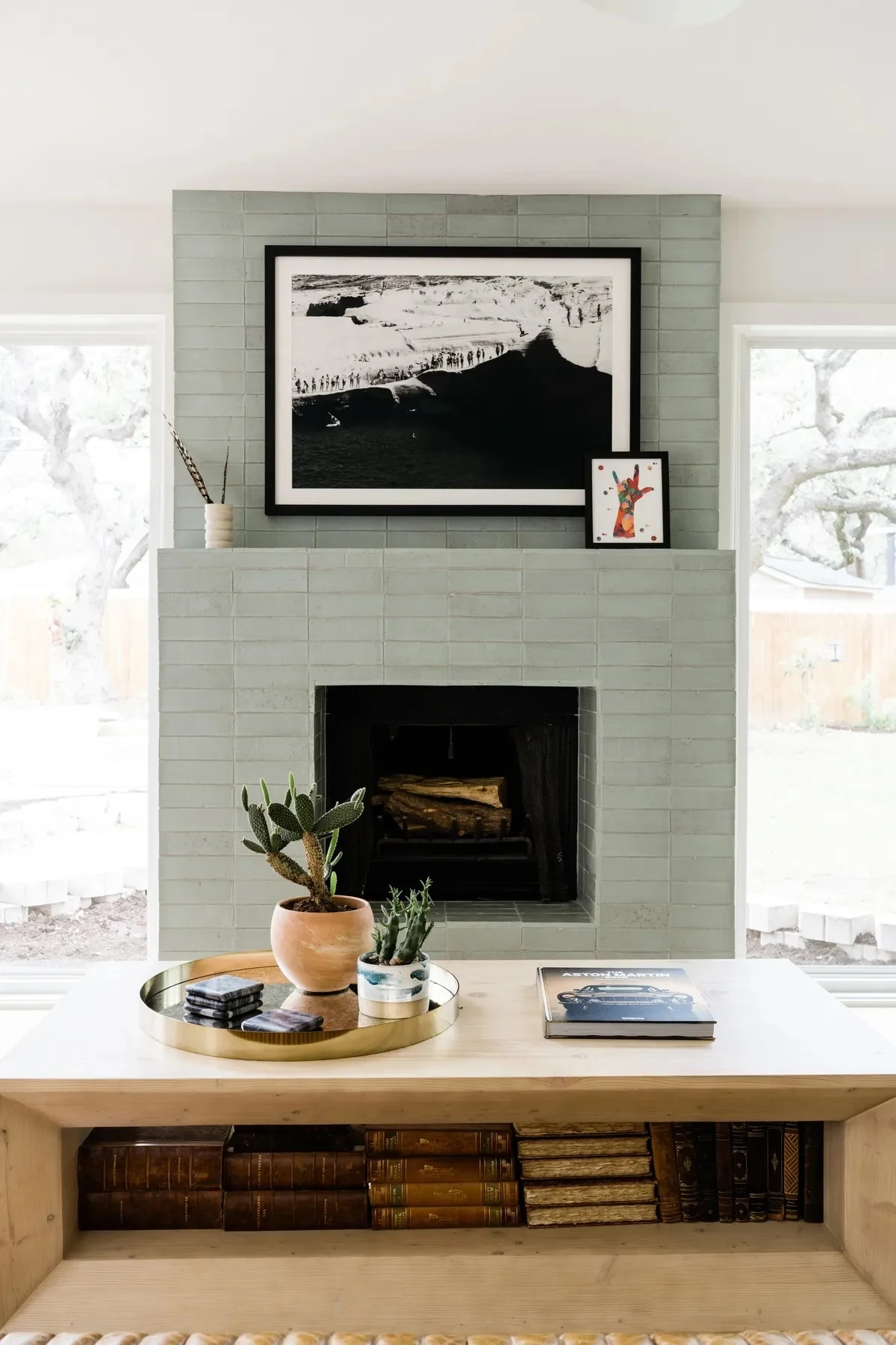
A darker floor can anchor a room, while lighter walls keep it feeling open. This combination is one of the most common and effective strategies because it grounds the space without closing it in. The floor acts as the base layer, while the lighter vertical surfaces lift the room visually and help reflect light.
A statement backsplash becomes a focal point when surrounding elements are more understated. This is where restraint matters. If the backsplash is bold - whether through pattern, texture, or color - the surrounding cabinetry, counters, and wall tile often need to step back visually. That contrast is what allows the feature to feel intentional rather than overwhelming.
A feature wall works best when the rest of the space allows it to stand out. Whether it’s a shower wall, fireplace surround, or entry moment, a feature surface needs visual breathing room. If every surface is competing, the impact of that feature is lost. When the rest of the space is quieter, the eye naturally understands what to focus on.
These decisions are not random aesthetic preferences - they are part of a larger design logic that creates flow and balance. Visual weight is what allows a space to feel composed rather than scattered. It’s what makes a room feel like it was designed as a whole, instead of assembled piece by piece. When this is done well, you don’t necessarily notice the principle itself - you just feel that the space works.


How to Apply Visual Weight in Your Own Tile Project
You don’t need to be a designer to use this concept - you just need to be intentional
A good starting point is deciding where you want the eye to land first when someone walks into the space. That focal point becomes the anchor of your design. It might be the floor in a bathroom, a shower wall, a kitchen backsplash, or even a fireplace surround. Once that is defined, you can intentionally allow more visual weight there through color, pattern, scale, or texture. From there, everything else should support that decision rather than compete with it. For example, if your shower wall is the statement moment, then the surrounding surfaces - like the floor or adjacent walls - should feel quieter and more neutral so the feature can stand out. If your kitchen backsplash is the focal point, then the countertop, cabinetry, and wall paint should act as a backdrop that frames it rather than fights for attention.
It also helps to think in terms of contrast and balance across the entire room. Visual weight is rarely about one single choice - it’s about how multiple choices interact. If you’re choosing a bold or high-impact tile, consider pairing it with simpler, more understated materials nearby. This doesn’t mean everything else has to be plain, but it should feel supportive. On the other hand, if your overall palette is very light, minimal, or tonal, introducing one slightly heavier element - like a textured floor or a darker accent wall - can help ground the space and prevent it from feeling flat. This is the part of a tile project where thoughtful planning really pays off. When visual weight is distributed intentionally, the space feels cohesive, elevated, and easy to live in. When it isn’t, even expensive materials can feel disconnected from each other.

And this is exactly where working with an experienced tile installation team makes a difference. Proper tile installation is not just about precision - it’s about understanding layout flow, transitions between materials, grout decisions, and how each surface contributes to the overall design balance.

If you’re planning a tile renovation in Rhode Island, Connecticut, or Massachusetts, and want a team that understands both the technical installation and the design intention behind your project, we’d love to help bring it together.
We work with homeowners and business owners across New England tile installations, including bathrooms, kitchens, showers, floors, and full custom tile design projects - making sure every detail feels intentional, balanced, and built to last.

If you’re ready to plan your project or want guidance on the right tile direction for your space, reach out to Kasey Harkin Tile Installation to start your consultation.


Comments